English



"Dot plot" refers to a chart made up of dots. In a financial context, the term specifically denotes the chart published by the U.S. Federal Reserve (Fed) that displays individual estimates from participants in Federal Open Market Committee (FOMC) meetings-namely Fed governors and the presidents of the 12 regional Fed banks (including non-voting members for that year)-regarding the appropriate level for the policy interest rate.
• How does the Fed's dot plot work?
Each dot represents an FOMC participant's estimate of the interest rate level at the end of a specific year or over the long term.
For example, in the illustrative chart below, for the end of 2027, five participants estimate an interest rate of 3.00%, four estimate 3.25%, and the remaining participants offer other estimates.
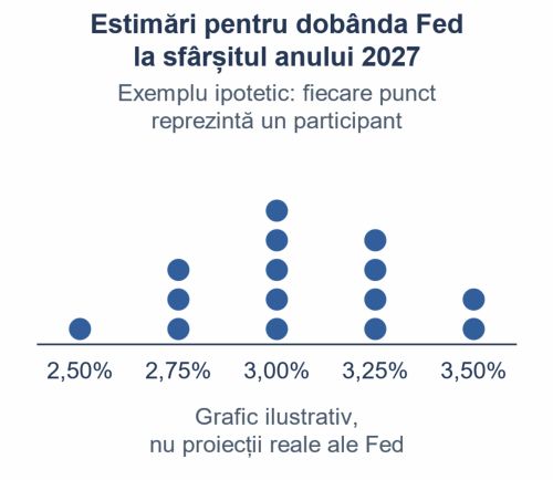
The illustrative chart shows estimates for a single year, with interest rates on the horizontal axis. In the chart published by the Fed, interest rates are on the vertical axis and years are on the horizontal axis: each column of dots corresponds to a specific year. This example is unrelated to actual Fed projections.
• Why is it important?
Financial markets monitor the "dot plot" to understand:
- the anticipated direction of US interest rates;
- the number of rate cuts or hikes suggested by participants' estimates;
- differences of opinion among FOMC participants;
- changes in expectations compared to previous projections.
Note: The dot plot does not represent a collective Fed decision, nor is it a commitment regarding future interest rates. Each dot represents an individual projection, and the estimates are anonymous.
Primary source: Federal Reserve - Summary of Economic Projections, a document published quarterly following the FOMC meetings in March, June, September, and December.


























 Euro
Euro Dolar SUA
 Franc elveţian
 Liră sterlină
 Gram de aur